The goal of any storefront signage should be to entice current and prospective customers. You have mere seconds to make a first impression, and your signage needs to balance the fine line of making your company “pop” while being clean enough that it’s legible. It should exemplify the heart of your brand, values and mission. Custom storefront signage done right differentiates itself, while also being captivating and pleasant to view. We’ve outlined 5 factors that will make sure you’re getting the most out of your storefront signage.
1. STOREFRONT SPACE
City Regulations
Before jumping straight into design details, take a step back and see what rules and regulations you have to follow. A great first step is to research your city’s signage code. Typically this falls under the planning department, and is based on what zoning your business falls under. Most often, your facade’s overall square footage along with your municipalities code will determine the size of your exterior building sign. It’s typical for the Kansas City region to allow the building sign to be 10% of the building façade’s total square footage. This would mean that a 10′ x 10′ storefront (100 square feet) could only have a sign that covers 10 square feet.
Variances
While city codes are the “rule of thumb” most companies have to abide by, there are always exceptions. To be considered as an exception, a variance can be filed. A variance request is exactly how it sounds, you are asking the city to give you permission to deviate from current code. Depending on your city, you may have to present to a zoning board why you are requesting a variance. Surrounding neighbors could be asked to weigh in. Presenting a clear and concise reason why the variance is needed and having community support will help your chances.
Reasons for requesting a variance are far and wide. You could request one if a sign that follows code wouldn’t be visible. This could be due to an obstruction such as trees, current construction, etc. You might also consider one if construction of a sign would obstruct traffic or motorists view, or if natural land features would have to be removed. This is another reason why knowing city code is important at the beginning. If you need to request a variance, often this will add time to your signage project. It’ll also add expenses in the form of administration fees and paperwork. It’s best to consult with your sign contractor from the start if a variance is needed, This ensures you are prepared and can adjust your timeline accordingly.
Landlord Restrictions
Additionally, for any business owners who rent their building, the landlord may have other signage restraints in the lease agreement. This can dictate anything in your sign from size to material to colors. You could have a sign that fits perfectly within your city’s sign regulations, but violates your landlord’s sign requirements. Before moving forward with any sign design elements, it’s important to check local and landlord restrictions. This will get your signage started off on the right foot.
2. SIZE AND PLACEMENT
Once you know the maximum size and regulations you must follow, it’s time to understand where your sign should be placed and how big your sign elements need to be. When determining, first ask yourself how your audience will view your sign. Will they be driving by? Will they be walking past? Setting your sign up for success means ensuring you have maximum visibility. You could have the best designed and fabricated sign in the world, but it means nothing if your target audience can’t see it.
For storefront signage that faces a road, position it perpendicular to drivers. A sign facing parallel to the road is harder to notice. To determine the placement of the sign and letter height, find the approximate distance at which customers will be passing by. If your audience is mostly driving by, place your sign so that it is within a “cone of visibility.” This means a driver must look no more than 20 degrees of either side of the road to see your sign.
For letter height size, every 10 feet of distance from your customer, letter height should go up an inch. As an example, if your customers will be fifty feet away, letter height at minimum should be 5 inches. Lastly, make sure any and all obstructions are out of the way. If you have a tall sign shrouded by trees, consider trimming them back. If trucks park in front of your building, place your sign high enough so drivers can see over them.
3. MATERIALS
Few business owners deal with signage on a day-to-day basis. Before designing your ideal sign, it can be worthwhile to educate yourself on signage types and materials. The old saying “you get what you pay for” most definitely applies to the signage industry. Knowing the pros and cons of different materials will help you narrow down your preferences. For example, printed fabric and banner signs will be the most economical, but won’t look as professional. They also won’t stand up over time and are susceptible to being damaged in the elements. Dimensional letters made from acrylic are weather resistant and have longevity, but won’t be illuminated for night-time view-ability. Dibond, an aluminum composite, with vinyl graphics is easily customized, but won’t have dimension. Channel letters are a popular choice, can be illuminated or non-illuminated, but are costlier.
Budget
One common mistake to avoid is waiting until the end of a build out to see what budget is left for signage. Signage is the first impression on a current or potential customer. Getting a sign contractor involved early in the process and having a budget set aside will ensure you don’t have to compromise. It’ll also help you understand what requirements have to be met for different types of signage. For example, electricians are brought in when installing illuminated signage. This is because a power source must be located near the illuminated sign. Knowing that there’s an extra electrical cost upfront for this will prevent you from getting a surprise bill when its time for finishing details.
Having an idea of the materials you need for a beautiful, eye-catching sign will help you know roughly how much you need to put aside in your budget. Neglecting the signage in lieu for a beautiful interior of your space will mean very little if your customer or vendor cannot locate you.
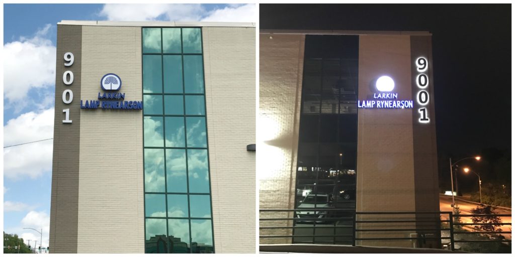
Illuminated channel letter sign during the day and at night
4. DESIGN
While the correct placement, size and material of a sign is critical, the design will be what makes it stand apart from others. If you don’t have an in-house graphic designer, most sign companies can assist for a fee. The cost associated with a professionally designed sign are well-worth it in the end.
When working on the preliminary design, make sure you are following the 60/40 rule. This means that for the sign area, the ideal ratio is 60 percent copy to 40 percent negative space. To make your sign unique, incorporate your logo. Use high-contrast colors that tie back to your company colors to create a long-lasting impression. Colors combos like black and white offer the highest contrast, while red and green offer the least. Making sure your sign is proportionate and uses clean font will ensure legibility. Cursive fonts are beautiful up close, but are harder to read than Comic Sans-serif and serif fonts. For information you’d like called out, signage is a great way to communicate to your customers. If your business is open into the evening hours, consider an illumination element. Different types of illumination can give your sign another edge. Options include anything from spot lights to backlit to halo-lit designs.
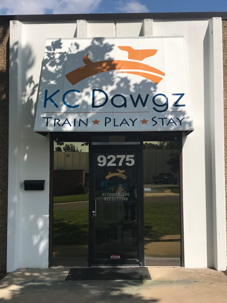
5. WINDOW SIGNAGE
To add cohesiveness to your storefront signage, window and door graphics are great accompaniments to your building signage. Door signage can be informative, listing your days and times of operation. It can also echo your building sign with additional logo art or images. Want to highlight a particular good or service you provide? Window signage can serve as extra advertising space for your business. Vinyl graphics and images can be installed on the interior of the window. This makes it an easy, quick and low-cost process with high impact. Kansas City and surrounding municipalities do not require a sign permit for vinyl installed on the interior of a building, further saving costs and installation time.
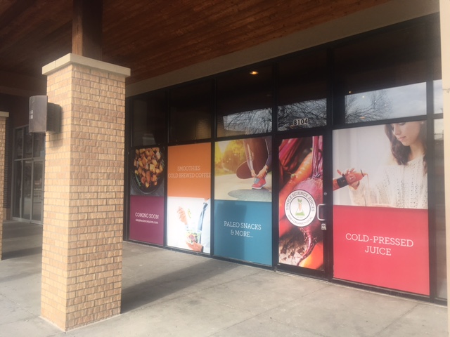
Window graphics make a big impact
Before considering any sign design, make sure to check local government and landlord regulations. If you have to request a variance, be able to provide why you need an exception to current code. Getting a sign company involved early will reduce headaches and give you an idea of how much to budget for signage. To optimize your storefront’s look, install a highly visible building sign with accompanying window and door graphics. Presenting a cohesive look throughout your storefront with highly contrasted colors and optimal placement will entice customers. To see examples of storefront signage we’ve done, check out this page.